Credit Card Process
Redesigning a complex banking flow into a simpler, scalable experience.
The credit card onboarding had high friction and drop-offs. The goal was to improve conversion, enable experimentation, and build more trust with users.
Digital contracting is one of the first point of contact between the user and the bank.
CONVERSION FUNNEL
After
27%
Before
53%

Context
The bank’s credit card onboarding experience was built on an outdated system that limited growth, experimentation, and flexibility. The journey created unnecessary friction early on, often preventing potential customers from moving forward before they could fully engage with the product.
This work focused on the acquisition experience turning a restrictive flow into a scalable platform designed to improve conversion, support continuous iteration, and create a more seamless and trustworthy first impression.
Objectives
Business
Increase onboarding conversion
Improve first card usage within the first 30 days
Enable funnel experimentation
Support omnichannel acquisition
Experience
Reduce friction
Improve trust and clarity
Make the process feel lighter and more personal
Technical
Create reusable patterns
Simplify future iterations
Support experimentation without rebuilding the flow
Before


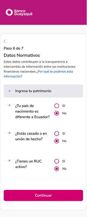


How we solved it
Research | Discover
Define | Problem statement
Ideation | Exploring solutions
Validation | Testing & iteration
Research
User persona
Pain points
Key insights
Through discovery research, we analyzed user behaviors, pain points, and expectations throughout the online credit card application journey. This helped identify key opportunities to create a clearer, more guided, and conversion-focused experience.
Key findings
Users felt overwhelmed by the amount of information requested during the application process.
The experience lacked clear progress indicators, making it difficult to understand what remained.
Conversational flows were engaging at the beginning but became inefficient in longer journeys.
Users sought reassurance and guidance when making financial decisions.
One important insight emerged early:
Users were significantly more likely to complete the process when the experience felt guided, transparent, and tailored to their needs.
Validation
Instead of iterating on a single concept, we explored multiple interaction models.
Model A: Step-based flow
Focused on clear progression, reduced cognitive load and faster completion
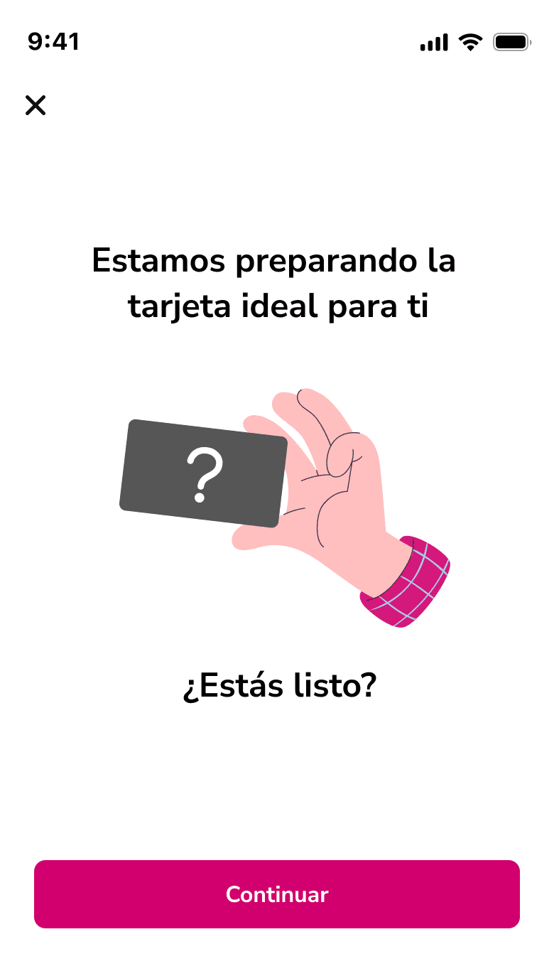
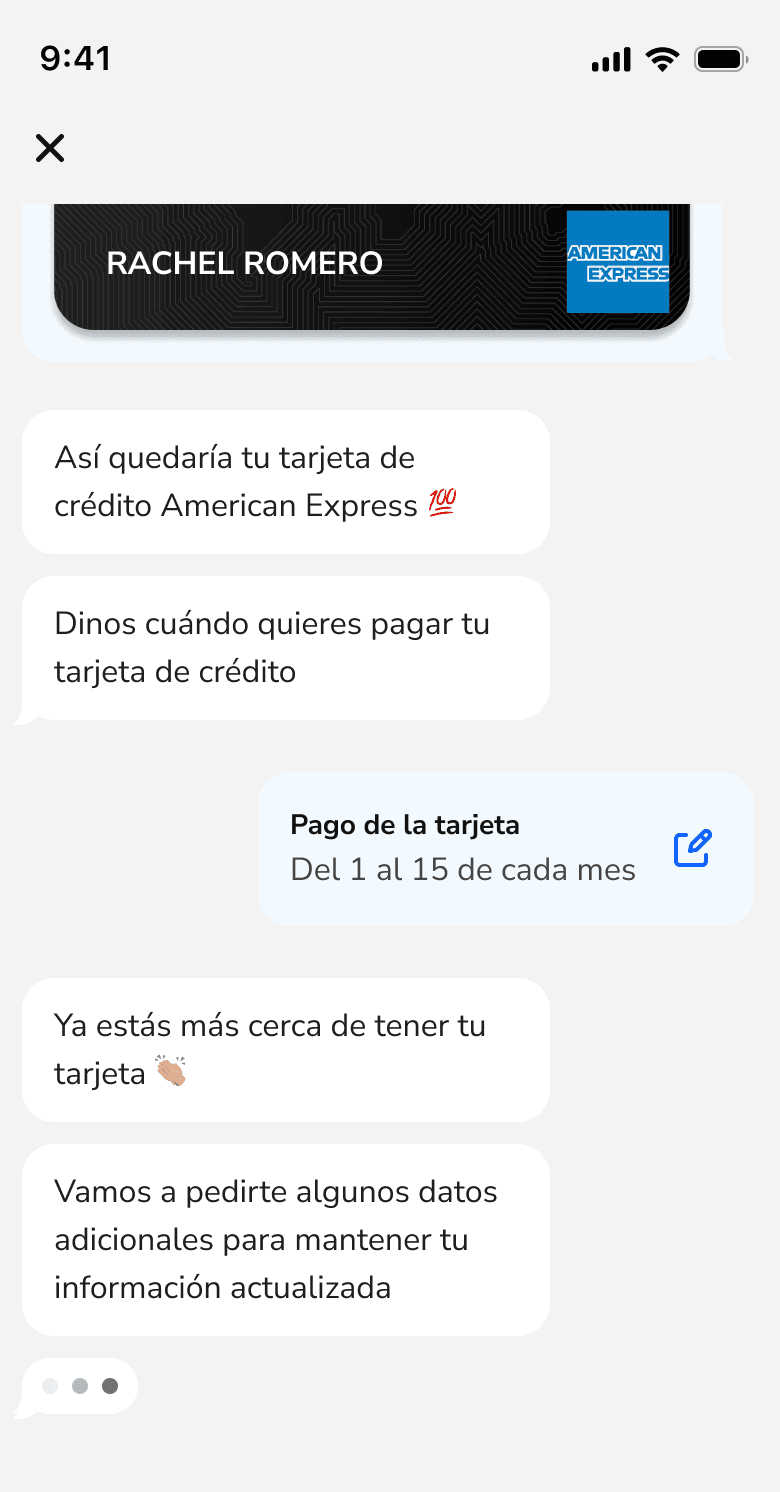
Model B: Conversational flow
A chat-like experience designed to feel more human and approachable.
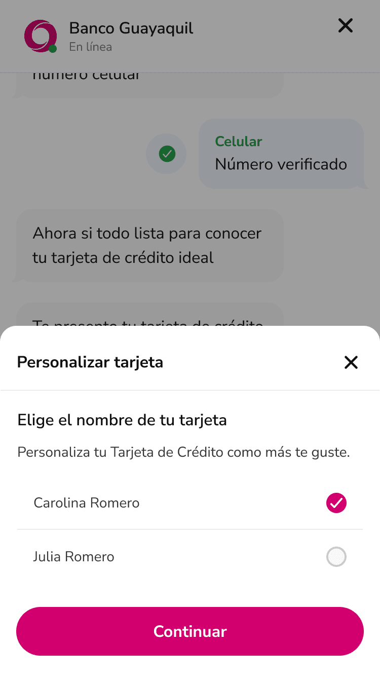
Model C: Hybrid conversational + forms
A balance between structured forms and conversational guidance.
Model A

Model B
Model C

Time complete
Success rate
Drop-off
Model A
Step-based
3 min 21s
81.6%
18.4%
Model B
Conversational
4 min 24s
66.7%
33.3%
Model C
Hybrid
4min 61s
84.6%
15.4%
Outcomes


Expansion to mobile app


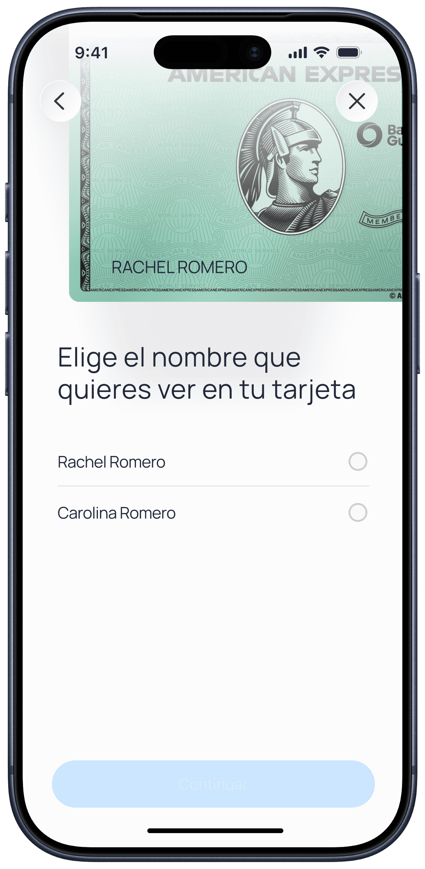
After redesigning the web funnel, we identified a clear opportunity inside the app. Users already authenticated in the ecosystem showed higher intent and trust.
We evolved the onboarding experience directly into the banking app. Results
General conversion:
38%
Conversion from app users: 44%
With that information, we redesigned the user journey to create a more modern and cohesive experience, reducing the number of steps required and making interactions simpler and more efficient for our customers.

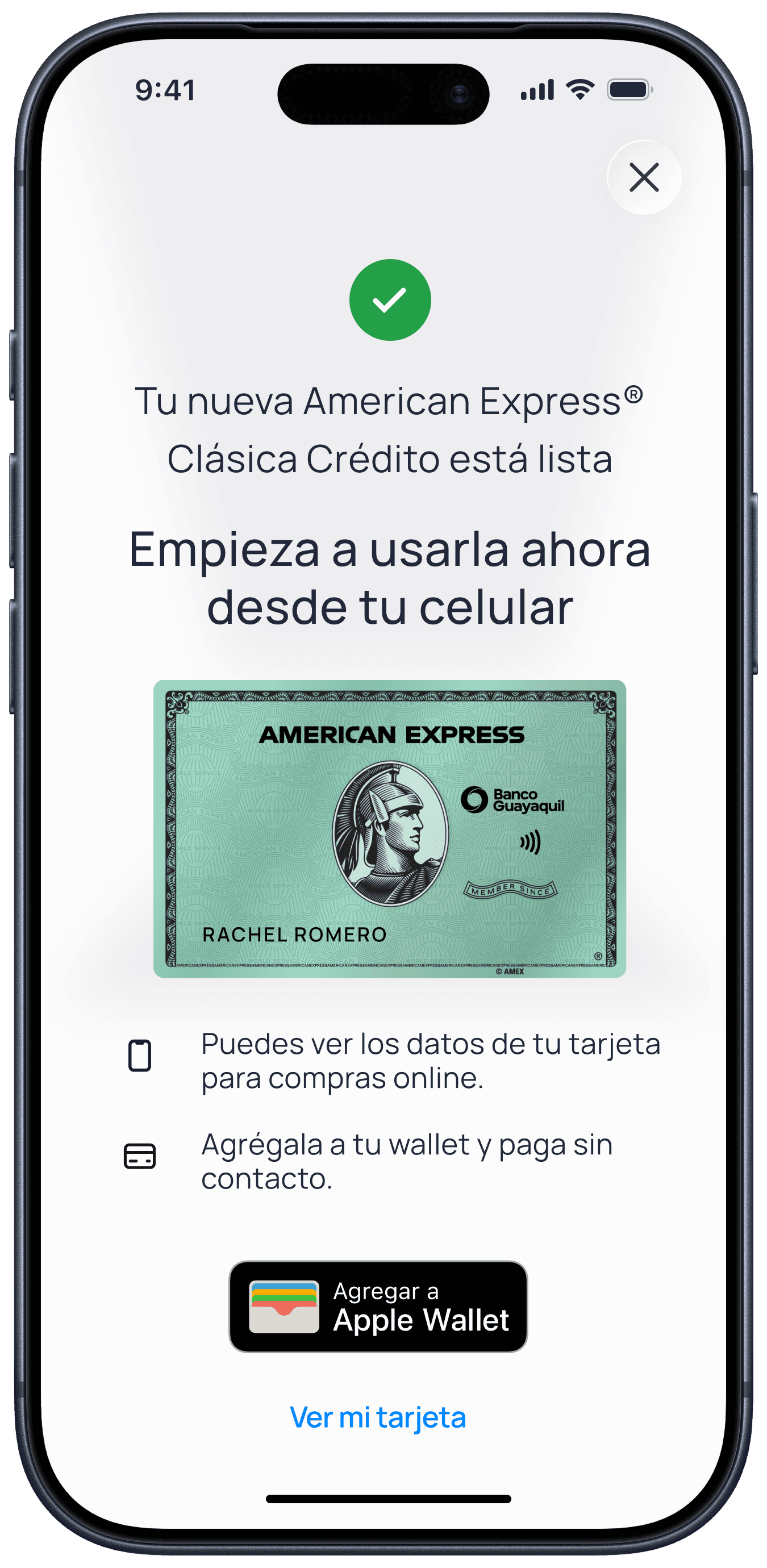
Key Product Decisions
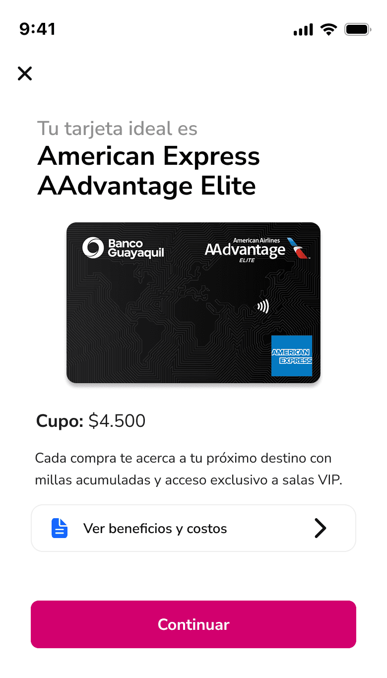
Personalized card recommendations
Help users find the most relevant product based on their needs.
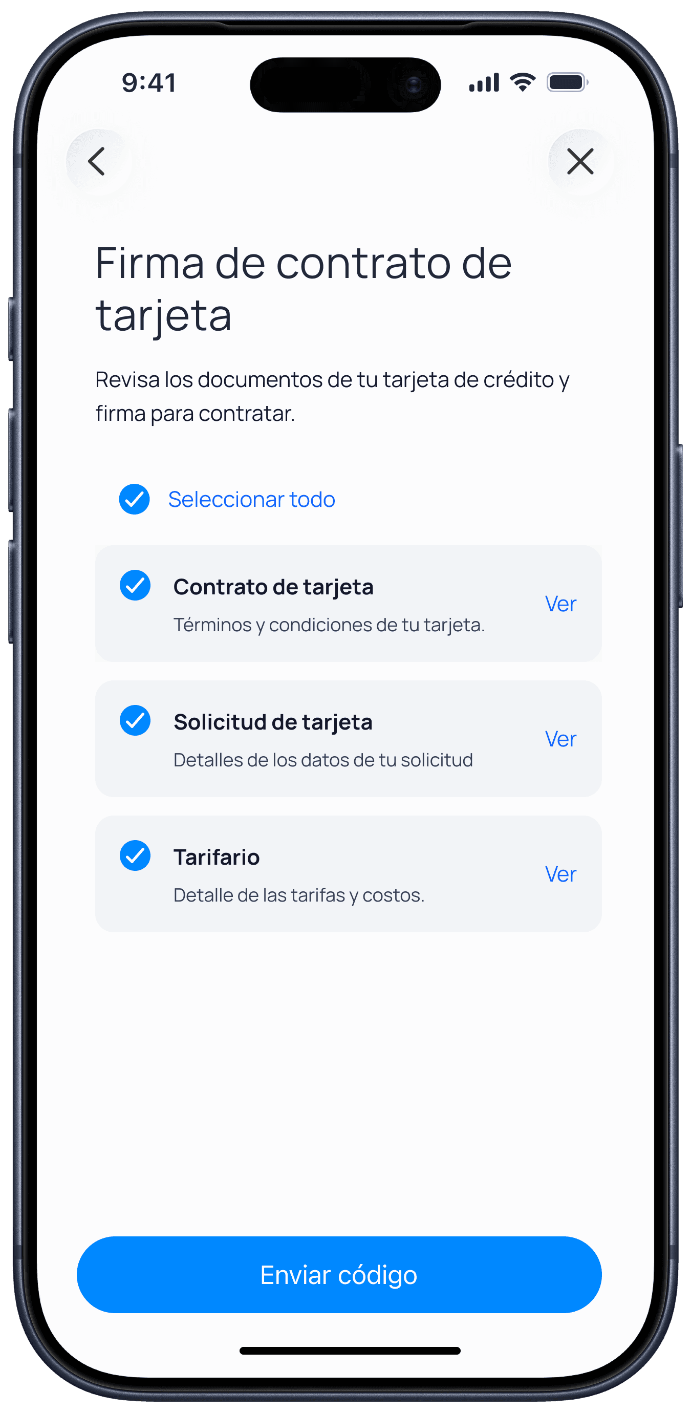
Electronic signature
Reduced friction and eliminated the need for physical documentation.
Progress tracking
Provided visibility into the application status and remaining steps.
Guided onboarding experience
Delivered contextual assistance throughout the journey.
Simplified data collection
Reduced cognitive load by breaking information into manageable steps.
Measurable funnel structure
Created clear stages for tracking performance and optimization.
What I learned
Designing for business and users
Balancing customer needs with conversion goals required continuous trade-offs and prioritization.
Building scalable systems
The solution was designed not only to solve current problems but to support future onboarding initiatives.
Data-informed decision making
Research and usability testing helped validate assumptions and guide product decisions.
© Todos los derechos reservados 2026
Rachel Romero
Quito Ecuador